Semantic colors at Jobber Bringing context to color

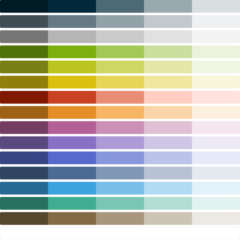
I defined and implemented a semantic color system in Atlantis and applied it in Jobber. Consistent/“correct” usage increased thanks to the meaning imbued in these values, despite the increased number of color tokens available to designers and devs.

Later, this semantic color system allowed us to execute on Jobber's larger visual language update extremely quickly.

As a bonus for the Atlantis team, support questions like “Which grey do we use for borders?” also decreased.

In short, I audited the colors in use, created meaningful names, and applied those names in Figma and code.

In… long? I:

  1. took screenshots of wide swaths of the Jobber product
  2. mapped out the most common patterns of usage and resolved inconsistencies (such as selecting the preferred value among four different grey tints being used to style borders)
  3. gave those patterns semantic names
  4. reviewed the names with a broader group of designers and developers
  5. added the semantic layer to Jobber's Figma library and the Atlantis codebase
  6. recruited a few developers to review a bunch of very tedious code changes in Jobber as a great deal of --color-green usages became --color-interactive, and various --color-blue, --color-blue--dark, and --color-black became --color-heading, and so on

Emily Carlin's Semantic Color System guide was a huge reference point.

What did this solve?

Too many options, not enough meaning

Atlantis (Jobber's design system) had 81 “base” color tokens (such as --color-blue, --color-blue--light, --color-blue--lighter, etc).

A sample of color swatches in dark blue, navy, grey-blue, grey, light green, lime green, yellow green, yellow, orange, red, pink, purple, teal, brown, navy
Quick, which of these colors looks like a good "border" color?

Designers and developers struggled to identify the right colors for…

Within those 81 values, many values look similar to each other. Design and development slowed down as teams constantly had to reference the live product or find other Figma files.

Visual consistency began to drift over time as a designer in one area of the product might, for example, adopt --color-grey--light for borders while another designer might adopt --color-greyBlue--lighter for the same purpose.

A challenge to change

Making systemic improvements to color was painful because UI elements were being styled using base values and often inconsistently. Interactive elements such as buttons, links, checkboxes and radios couldn't be updated without finding every instance of --color-green and replacing it… without breaking any other usages of --color-green in other contexts.